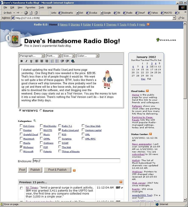
 I think it must be very hard to rework the UI of an open source product because responsibility for different parts of the product are allocated according to the structure of the UI. Same for a product that’s managed by a large development company with lots of users. It’s virtually impossible to re-think the top-level structure of the product. Much the same way you can’t re-think how the streets in a city work. Too much is built around the way things are. Maybe it’s true for movies and books too? Hmmm. Maybe you can only make big changes early in the life of an idea. What set me going in this direction is the way the UI of Radio UserLand was organized. We decided to start over from scratch in 2001. We already had a blogging tool, Manila, which had grown into a sprawl as we invented new tools to hang on a structure that wasn’t designed for so much functionality. With Radio, I wanted to see if we could take the same functionality and make it tight and focused. It worked. There were two main screens, one for writing (the home page) and one for reading (the first link off the home page). Here’s a screen shot. Could you rework a product like WordPress to work this way? Yes, I believe technically it’s possible. It would just be another interface on the same functionality. It would not be able to do all that WordPress could, but for most people that’s fine because most of what most people do can be covered by much less than all the UI, at least in theory, imho, ymmv, I am not a lawyer, murphy-willing, my mother loves me and all other disclaimers.#
14 Aug
